See you next time!

And we're done for real!

That was at least two lessons—maybe three—packed into one. (If you think we should break it up, let us know in the feedback. We kept it as one to help you build a continuous world.)

First, we looked at images and talked about contrast as a concept:

  • Pretty much everything of interest in a story arises out of contrast.
  • Contrast is about differences that help us perceive the world more vividly.
  • We can have contrasting values in many dimensions: luminance, colour, texture, shape, size, age, position...
  • And if we congeal contrasting values into physical forms and put them next to each other, we get juxtaposition.
  • Juxtaposition helps us perceive both things more clearly.
  • But juxtaposition isn't only about physical features; it can also highlight conceptual and emotional features.
  • If we take figures with contrasting meanings and juxtapose them, then that clash of meaning creates a kind of mental and emotional resonance that we often feel compelled to explore, almost as if we are trying to silence a bell that has gone off inside our heads.
  • These resonances can cause us to feel surprised, alarmed, interested, sad, and to ask questions about what happened and why.
  • Contrast also sets the conditions for conflict, and the more resonant the juxtaposition, the more rich and complex we are likely to find the conflict.

We explored lots of story elements that contrast can enhance, including:

  • Physical features
  • Landscape and environment
  • Personality
  • Relationships
  • Expectations and social norms
  • Inner complexity
  • The passage of time
  • Current and future self
  • Divisions in the world

We explored how we can use contrast to create emotional effects, such as:

  • Fear and uneasiness
  • Surprise
  • Humour

And finally we used contrast to set up conflict and then escalate it into action, as the contrasting forces try to close the gap between them.

And believe it or not, we could have kept going! Once you start looking at contrast in art, it's hard to stop because it underpins everything.

But we don't need to keep going because you have the basic idea now, and you can take it from here.

Stop at any random point and look for contrast. You'll find it.

If you're bored with what you're reading, do this and you'll probably find one of two things:

  • You notice contrast that had previously been below your threshold of perception, and now the story is more interesting.
  • Or you see that there is no contrast, and now you have an explanation for why the story is boring.

Now that you're sensitised to contrast and juxtaposition, you can look for it anywhere.

As with the advice about reading, if you are ever bored in daily life, simply look around you for any source of contrast and you'll find something interesting.

Where did the snippets come from?

Graveyard Book cover

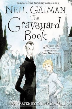
The Graveyard Book, by Neil Gaiman

Modelled on Rudyard Kipling's The Jungle Book, this is the story of an orphan called Nobody Owens who is adopted by the undead inhabitants of a local graveyard and protected from the men who would kill him.


Cover of My Family and Other Animals

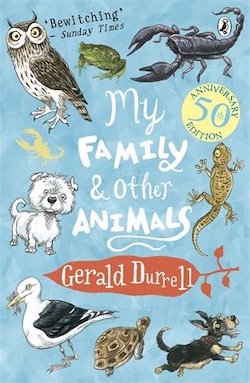
My Family and Other Animals, by Gerald Durrell

When British naturalist Gerald Durrell was a child, his family moved to the Greek island of Corfu. This is his memoir of the time, about a family out of their element and surrounded by wild animals.


Cover of The House on Mango Street

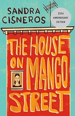
The House on Mango Street, by Sandra Cisneros

A portrait of a Latina girl growing up in Chicago who longs to escape from the oppressive and controlling men in her community and be free to live her own life. Beautiful, poetic, moving.


Cover of Forged by Fire

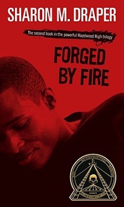
Forged by Fire, by Sharon M. Draper

The story of a teenage boy who struggles to escape a cycle of family violence and poverty. Full of escalating drama.


Cover of Growing Up Aboriginal in Australia

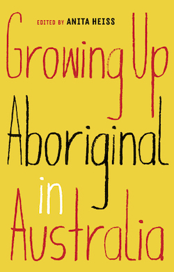
Growing Up Aboriginal in Australia, edited by Anita Heiss

A collection of personal stories from Aboriginal Australians of all ages and backgrounds, about the shared struggles and joys of being First Nations in a colonial state, and the diversity of individual experience. 


Tom Sawyer cover

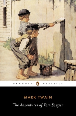
The Adventures of Tom Sawyer, by Mark Twain

The Adventures of Tom Sawyer feature truancy, scams, piracy, murder, grave-robbing, romance, and buried treasure. An American classic.


Cover of Growing Up Disabled in Australia

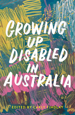
Growing up Disabled in Australia, edited by Carly Findlay

A collection of honest, personal, and detailed accounts of what it is like to grow up with disability or chronic illness. A great shared account of experiences that affect many people, but are rarely represented in media.


Cover of Geek Girl

Geek Girl, by Holly Smale

Harriet Manners is a wildly misunderstood nerd at school, but when she is scouted by a modelling agent, she thinks shes a way to transform herself. But she's mostly wrong.


Cover of I Am a Genius of Unspeakable Evil and I Want to Be Your Class President

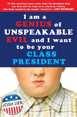
I Am a Genius of Unspeakable Evil, and I Want to Be Your Class President, by Josh Lieb

Very funny story of a 13 year-old who is hell-bent on world domination, and is well on his way towards achieving it, when he gets sucked into proving that he can win his school election.


Peter Pan cover

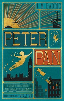
Peter Pan, by J.M.Barrie

The story of a boy who can fly and refuses to grow up, and a family of children he leads to magical island of Neverland. More lyrical and melancholy than you might think. 

A woman in a chair unzips colours from the wall.

There was something we really wanted to talk about in the first section of this lesson, when we were looking at photos, but we felt like we were already neck-deep in a rabbit hole and there was no need to go further.

But here we are, at the end of the lesson, and if you feel like putting your head all the way into the rabbit-hole, let's do it now.

It's basically this, if you've wondered at all why contrast is so powerful, there's a whole field of scientific study about how we are wired to notice contrasts.

Take a look at a few of these research materials and see what you notice about your own perception:

Diagram showing luminance and orientation contrasts

Another illustration showing a variation

Another illustration this time using colour

A grid of tiny images of buildings, objects, and faces, and a chart showing we see faces more clearly

You probably notice a few things:

  • Luminance has a huge impact on contrast.
  • Colour has some impact.
  • Orientation has a little impact, but if added to luminance has a big impact.
  • We spot faces almost immediately.

The point of sharing this is to show that we are innately wired to sense contrast, and some contrasts are more compelling than others.

So when we read a story, we are actively hunting for contrasts without even realising it. If there's no contrast, we start to drift off because there's literally nothing attracting our attention.

But even the smallest contrast can get our interest, and if that is amplified through tonality, emotion, character all at the same time, then we can get hooked.

###

If you're curious to see some of these research papers:

Collage of a couple arm in arm looking in the distance, but one of pair has been cut out and replaced with a forest