Contrast

In visual art, there are two main dimensions of what we call tonal contrast.

The first is luminance, meaning light vs dark tones. 🌗

Landscape lost in fog so you can't see anything

👆 In this image, there is not much difference between the darkest region and the lightest region—it's all a similar mid-tone.

So we say this image has low contrast. 🌫 

Landscape photo of Half Dome in Yosemite with moon above

In contrast (🙄), this image 👆 has regions that are almost completely dark and regions that are almost completely light.

So we say it's high-contrast. ⬛

But tonal contrast isn't only about light vs dark: colours also create contrast. 🎨  

For example, what can you make out in this painting?

Waterloo bridge in fog painted by monet all blue and pink

👆  This painting is all cool blues and pinks. There is enough contrast between these colours that you can barely make out the shape of the bridge.

If we remove the colour, you can see how much of the image is defined by luminance contrast vs how much is defined by colour contrast. (It's about 50/50!)

Waterloo bridge painting with colour removed so all that is visible is shadows under bridge

Portrait of van Gogh with palette showing lots of contrasting colours

In comparison, this image 👆 uses contrasting colours in key areas. Can you find examples of colours that seem to 'jump out' from each other?

If we look at this image in greyscale, we really see the impact of colour contrast.

Van Gogh portrait with palette greyscale so that beard and jacket look the same and palette has nothing on it

Compare three regions to the original:

  • The palette now looks like it has nothing on it, whereas in colour it is covered in paints.
  • His beard blends into his jacket, whereas in colour his beard jumps out as a primary focal point.
  • His jacket looks like a uniform shade of grey, whereas in colour it is flecked with orange which jumps out from the blue.

You might have already figured this out, but contrast is important because it helps us perceive the world.

For example, you've probably never seen a mushroom as clearly as before seeing this image:

Fine edges of mushroom cap in high contrast photo

Luminance and colour are just two sources of contrast. But we perceive contrasts with all of our senses.

Sight, sound, touch, smell, taste—whatever the sense, we use contrast to find the edges of things, and by knowing the edges we know the whole (to an extent).

  • When blind people read braille, they are sensing contrasts in texture.
  • When hearing people listen to music, they sense contrasts in pitch, volume, timbre, rhythm.
  • When deaf people listen to music, they sense contrasts in physical pressure, including intensity, timing, and rhythm.

This means there are many more tonal contrasts than just light vs dark or blue vs yellow and orange vs green. We also have:

  • Hot vs cold
  • Rough vs smooth
  • Hard vs soft
  • Quiet vs loud
  • Sweet vs bitter

And many more.

If you want to hear some examples of contrast in music, consider these three pieces.

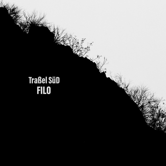
First, ambient music from Traßel SüD. This establishes a good baseline for what "low-contrast" music sounds like:

Filo by Traßel SüD Spotify | YouTube

You can hear that this is all soft, tonal, ambient music. There's a shape, but it's airy and spacious. If it contrasts with anything, it's the noise and brightness of the world outside.

Landscape image


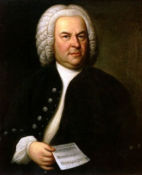
Next, an example of a classical piano piece that could be considered low or high-contrast, depending on how you look at it:

Partita No. 1 in B-Flat Major, BWV 825: V. Minuetts I & II by Johann Sebastian Bach Spotify | Youtube

If you listen to this composition, you'll notice the dinky-dinky quality, and if you're not familiar it might sound like clockwork noise. But if you listen closely you'll find contrast in the way that melodic lines ascend and descend inside the loops.

J.S. Bach


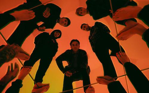
In comparison, here is a contemporary pop-rock song that is relatively high-contrast:

Parasite Eve by Bring Me The Horizon Spotify | Youtube

If you listen to this song, you'll find it's full of deliberate and overt contrasts between volumes, timbres, and rhythms.

Bring Me The Horizon

So our first big point is that contrast adds definition, which helps us perceive the world.

But! That doesn't mean that more contrast is always better!

High contrast vs low contrast is like hard vs soft, one is not better than the other. They are just different, and they create different experiences.

Here's the thing, we are super sensitive to contrast, so much so that if it is at all perceivable, we will notice it.

And there's no such thing as 'no contrast'.

We'll prove it: here's an image with 'no contrast':

(Don't believe us? Right click and open in a new tab!)

A square that is the same colour as the background

☝️  You can't get much lower contrast than a featureless square that is the same colour as the background. 

But does that mean there is no contrast? 

Well, think of it this way: can you perceive there is a big invisible square above? 

Yes, you can, because contrast is about edges, and while the square has no bumps or edges inside itself, it absolutely has edges that define its boundary with the rest of the world. 

In fact, this contrastless square sticks out like a dog in a handbag.

And so that is how the contrastless thing creates an impact in the world: by carving out a space.

(Ever gone looking for silence? Same thing.)

Alright, we've talked about contrast in terms of tonal qualities.

But if we congeal a set of qualities into a tangible thing (like coalescing the qualities of big, heavy, slow, and rough into an elephant) and put it next to another thing congealed out of contrasting qualities (like small, soft, and nimble coalesced into a young girl), we get a specific form of contrast called juxtaposition.

What does that look like?